New version available
Version 1.3 of the template is now available which fixes the problems reported in Netscape 4. Please view the new template at http://www.benmeadowcroft.com/webdev/template_1_3/template.html
Template Info
Hi, this is a sample HTML document showing how to use the css templates I developed.
This layout is inspired by many of the other resources which are available out there (a few are listed later), however looking at it now in comparison with what I started with it is very much my own work.
What makes this one any good then?
Alternate Stylesheets
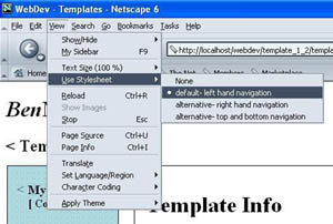
| Well in this revision I've just introduced alternate stylesheets into the mix, if you have a suitable browser (some of the later versions of Mozilla and Netscape 6.x) you can choose the way this page is displayed yourself. In Netscape 6.1 (the version I tested) go to the "view" menu and select "use stylesheet". You should now be presented with a few options allowing you to quickly change how the navigation is laid out in this example. |  |
Resizeable menu
Another enhancement has been the replacement of pixel sizing with em's.
This means that the width of the menu and the margin of the content are now resized relative the the text size (in browsers which support this), which I think gives it a better overall look. (if you're using IE for example select a different text size from the view menu to see what I mean).
More files than you can shake a stick at
well you should have got the this (1) XHTML document, (5) stylesheets and (4) graphics.
The XHTML document you are reading shows how I structured my documents in a valid way to ensure that the stylesheets worked correctly.
The three main stylesheets deal with three different aspects of the document:
- style.css
- This stylesheet handles the font style, colours (yes that's how we spell it in england), background images and the like.
- screenlayout.css
- This handles the layout of the page on the screen.
- printlayout.css
- This layout handles the layout of the page when it is printed. The sidebar stuff is hidden and the margins are slightly different from the screen layout.
Two more alternate layout stylesheets are also available. These can be seen in alternate stylesheet aware browsers.
- screenlayout2.css
- This is an alternate layout stylesheet
- screenlayout3.css
- This is another alternate layout stylesheet
The four graphics are two menu backgrounds, one page background and a screen shot.
There is nothing special here, but I like the fact that the two menu backgrounds are semi transparent gif's so that when viewed on a browser like IE6, NS6 or Opera 6 (all tested on Windows PC) you get a cool filtered effect on the image used for the page background (I was pretty pleased when I first thought of trying it and it worked!). The screenshot is included for those who downloaded this page from a zip.
 +
+ ![]() +
+ ![]()
I used 16 by 16 pixel images rather than 2 by 2 images for the menus as these render faster on slower computers (like I used to have! I know from experience)
Well that's about it
Feel free to use and modify anything I have supplied in the zip package. Stuff that is on my website but not in the zip is not being offered freely by myself so please don't copy it. If you have any comments to make about these stylesheets or my website feel free to email me [email protected]. If you do use this stuff on your website I would appreciate a link back to my site if appropropiate (and if you consider my site worth linking back to!), though this is not required or anything.
Last minute note for IE6 (and probably the others IE's as well) make sure that the names of the menu items are not too long, or that you adjust the sidebar width accordingly (if an item is too long e.g. superfragiliciousexpiallidociuos or something, then the menu width will take the width of that word, so make sure your menu items are relatively short, or have spaces in them, so they can be split onto more than one line).
If you're interested in learning about how one site dealt with the move from table based layouts to the style sheet method read about the process one site made towards that goal. alistapart.com
This web site, webstandards.org, explains the role webstandards have to play in all in making the web more accessible for everyone.
This was the first site to link to this resource (of which I am aware) www.web-building.com so I am going to include this site in here as well. A good source of css layouts is BlueRobot.com they inspired my dabblings anyway.